Pediatric ICU
The UCSD Pediatric ICU project was comprised of four components: an 8-Bed Pediatric Intensive Care Unit, a 4-Bed Pediatric Intensive Care Unit, a family area, and a sophisticated treatment area for both inpatients and outpatients.
The facility serves pediatric patients, with the most severe of injuries as well as those less critical. As such, the spaces respond to numerous functional requirements, patient needs and perceptions. Working along side an existing 3-Story Rotunda was very challenging. The first challenge was to use the precious space available wisely, second to maintain observation of patients and finally to create a space that had a sense about architecture while dealing with all of the more important functional issues and the existing rotunda.
The approach taken with the PICU is to assemble a collection of subtle yet detailed parts to create a project that, as a whole, conveys an image of professional confidence and makes children relax and parents feel like they have arrived at a place where their child will be taken care of.
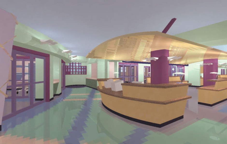
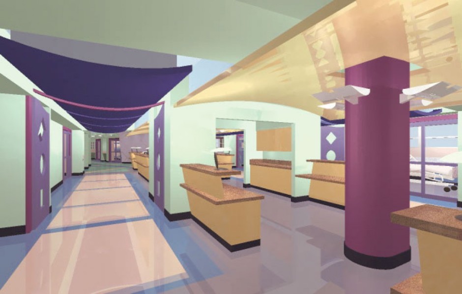
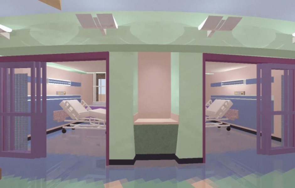
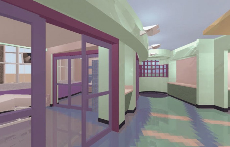
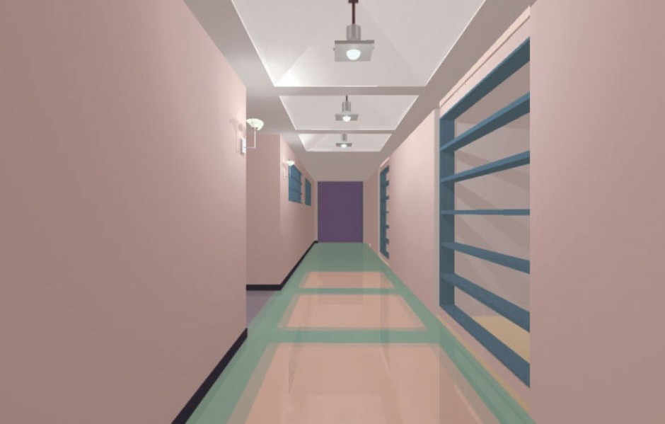
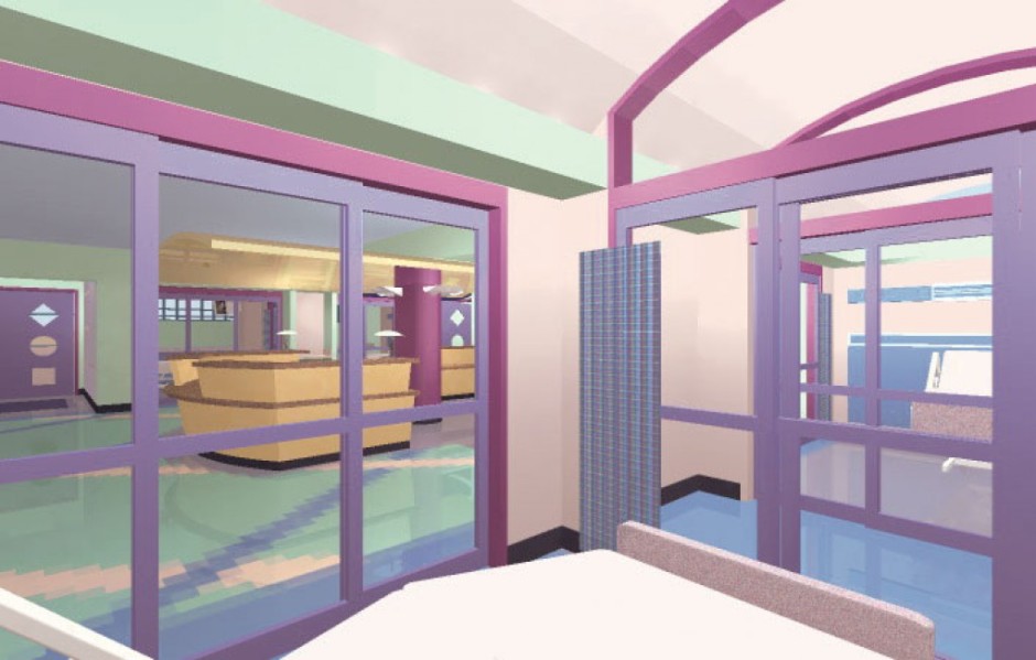
Upon entering the PICU, the intent is to express a spatial quality atypical of most hospitals. The patient rooms curve along the Rotunda and are separated from the nurse station by sliding glass walls allowing for patient observation and natural light to enter through to the center of the unit. Numerous complementary “floating” ceiling elements play off the main creating a playful effect that is engaging as well as fun. Great attention has been given to floor and ceiling patterns. By allowing the patterns to flow and transform from space to space, a unique blend of continuity and complexity is achieved.
The focal point of the Pediatric ICU is the nurse station which collects the patient rooms around it. The nurse station is open with a horseshoe shaped countertop anchored by a playful architectural feature that houses the medication station. Architecturally, this creates an image of strength and control for the nurse station, while meeting and exceeding all of the functional needs of the staff.
The back to back design of the units makes them feel like one 12-bed unit instead of and 8-bed and a 4-bed unit. This was done for flexibility of staffing. If the census only demands 8 icu beds then the separate 4 can be used as step down unit. This allows significant savings in staffing while maintaining all of the necessary requirements and separation for licensure.

